Business dashboards vs reports — it sounds like a minor detail. But it’s one of the most important distinctions in data-driven decision-making. Maybe you’ve heard both terms tossed around in meetings as if they’re interchangeable. They’re not. And knowing the difference can mean getting quick, visual insights—or diving into rich context and detailed analysis.
Business Dashboards vs Reports: What’s the Real Difference?
Maybe you’ve heard it during a meeting. Someone says, “Pull up the dashboard.” Five minutes later, another colleague asks, “Do we have a report on this?” The words ‘dashboard’ and ‘report’ are tossed around as if they mean the same thing. But they usually don’t. The difference might seem small at first, but, in practice, it’s the line between quick insight and detailed analysis. Understanding this gap matters, especially when decisions ride on getting the right data in the right form, fast.
For anyone building KPIs or dashboards—like we do at LucasSanroma.com—this distinction is part of everyday work. Still, I’d wager many people have felt a little unsure about where one stops and the other begins. I know I have, at least in the beginning.
Beginning with a question: what problem do you need to solve?
Imagine you’re a founder having coffee. Orders are up, but profits seem stuck. You want answers, and you want them before your espresso gets cold. Do you want a dashboard or a report? It depends on the kind of question you’re asking.
- f you need a quick check—“How are we doing right now?”—a dashboard serves you best.
- If you want to go deeper—“Why did profits fall last quarter?”—then you’re really after a report.
Distilling it down:
Dashboards tell you what’s happening. Reports help you understand why.
What is a dashboard?
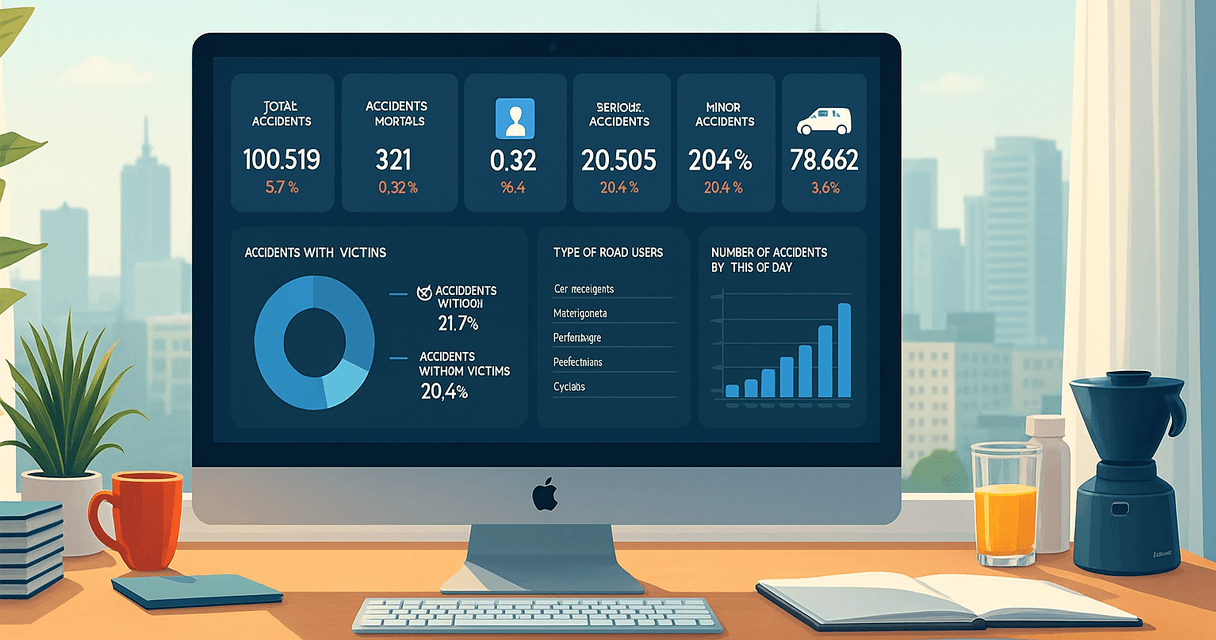
Think of a dashboard as a control panel. Imagine the instrument cluster in your car—speedometer, fuel gauge, warning lights. Everything you need for a fast assessment, all at a glance.
In business, dashboards offer live or nearly live visuals. You’ll see graphs, charts, KPIs, and maybe color-coded signals. Not a lot of explanations, just data talking to you, straight and direct.

What makes a dashboard… a dashboard?
There’s no single formula—but most definitions agree that a dashboard is a visual display of the most important information needed to achieve one or more objectives, consolidated on a single screen so it can be monitored at a glance.
According to experts like Stephen Few, a dashboard doesn’t have to include real-time data, fancy icons, or even interactivity. What matters is the clarity, relevance, and readability of the information.
What good dashboards usually have in common:
- Summary view: They highlight only the most relevant metrics or KPIs—what matters most to the user.
- Visual encoding: They use charts, color, and layout to make data understandable quickly, but avoid unnecessary decoration.
- Single-screen focus: A dashboard should be scanned in seconds—not navigated like a report.
- Purpose-driven design: Dashboards are built around specific decision-making needs—not just to display data.
At LucasSanroma.com, our dashboard templates are inspired by these principles—minimalist, purposeful, and adapted to how real people make decisions in real-world businesses.
What is a report?
Now, think of a report like your car’s full maintenance manual. It’s not designed for quick glances while driving—it’s built for understanding what’s been happening over time, and what actions you may need to take next.
In a business context, a report provides detailed information, often combining historical data, narrative explanations, and structured analysis. While a dashboard might tell you that fuel is low, a report explains why, since when, under what conditions, and what might be causing the issue.
Unlike dashboards, which prioritize speed and glanceability, reports are meant to answer deeper questions, support decision-making processes, and often serve as official records for teams, management, or external stakeholders.

Key features of reports
- In-depth and structured: Reports typically span multiple pages, sections, or tabs—bringing together KPIs, comparisons, detailed breakdowns, and supporting commentary.
- Historical context: They are often used to analyze trends over time—quarter-over-quarter, year-over-year, or across different segments.
- Text-driven analysis: Reports frequently include recommendations, root cause analysis, annotations, or methodology notes that are not present in dashboards.
- Static (usually): Most reports are created for a specific point in time—“as of” a date. While modern platforms like Power BI offer interactive or paginated reports, they still follow a linear, explanatory format.
- Formal presentation: Reports are designed for sharing, archiving, or regulatory compliance. They’re often exported as PDFs, printed, or saved as full Excel workbooks with multiple sheets.
Side-by-side: key differences between business dashboards vs reports
At first glance, business dashboards vs reports might seem like just two ways of presenting data. But in practice, they reflect very different goals—and influence how people think, decide, plan, and communicate.
| Feature | Dashboards | Reports |
| Purpose | Show current status or performance | Explain causes, trends, and context |
| Frequency | Frequently updated or real-time | Generated periodically (weekly, monthly, quarterly) |
| Interactivity | Often interactive (filters, drill-downs) | Typically static, with a fixed structure |
| Format | Visual, compact, often single-screen | Multi-page, text-heavy, includes narrative |
| Recipients | For operational teams and managers | For executives, external stakeholders, audits |
Typical use cases and scenarios
Choosing between a business dashboard and a report often depends on the moment: is it urgent, routine, strategic, or operational? Here are some typical examples:
Dashboard
- Sales teams check dashboards during daily stand-ups to track progress.
- A store manager reviews inventory levels on a visual board before opening.
- A project leader monitors deadlines and risks in near real-time.
Reports
- After closing the quarter, finance compiles a full performance report for leadership.
- A startup founder prepares an investor report, complete with trends, commentary, and forecasts.
- An HR team analyzes turnover data across the past year to support workforce planning.
Truth is, sometimes you need both—side by side. Ever toggled between a dashboard’s sales KPI and the quarterly report’s deep sales narrative hoping the story matches? Most of us have. In our work at LucasSanroma.com, we often design templates that let you click from one view to the other, pulling fast KPIs into a detailed story, blending both worlds.
Design: why dashboards look and feel different from reports
The way a dashboard or report is built says a lot about its purpose. Design is more than color and font choices—it’s about surfacing what the decision-maker needs to see, and deliberately leaving out what they don’t.
- Dashboards cut through the noise. A well-designed dashboard highlights only what requires immediate attention.
- Reports absorb the noise. They give space for exploration, context, and pattern recognition—especially over time.
Designing a dashboard for the web is very different from building a report in Excel or PowerPoint. Dashboards must be quick to scan, even on a phone. Reports, on the other hand, must withstand detailed review in a boardroom setting
Dashboards are for action. Reports are for reflection.
What good looks like (and what doesn’t)
- Dashboard “sins”: Too much data, poor color contrast, crammed visuals, or so much interactivity that users get lost. Worst offense? Hiding a real problem in cheerfully colored graphs.
- Report “sins”: Stale data, missing context, walls of text, or no clear next steps. Too easy to ignore or file away—sometimes forever.
Creating something that fits the real world—where decisions aren’t always linear or simple—matters a lot. That’s partly why the distinction isn’t just academic; it’s lived experience, both successes and frustrations.
How dashboards and reports work together
You might wonder, “Do I really need both?” Maybe not every day. But, in a business that changes quickly, people often need both. Dashboards guide you in real time; reports capture the full narrative with all the twists, drama, and complexity.
A common pattern:
- Someone checks a dashboard and spots a dip.
- They dig out a report to understand what caused it.
- They use both—headline trends from dashboards, explanations and recommendations from reports—to plan the next move.
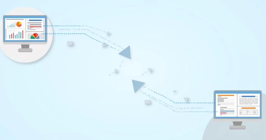
In small companies or startups, sometimes you don’t have the luxury of two separate systems. There, hybrid tools or flexible templates (the kind LucasSanroma.com specializes in) let users pivot from summary to detail quickly, often with a single click or tap.
Tools you might use
Dashboards:
Popular tools for creating business dashboards include
- Power BI,
- Tableau, and
- Looker Studio (formerly Google Data Studio).
For fast, DIY dashboards, many still rely on Microsoft Excel, especially in small businesses and early-stage teams.
Reports:
For more detailed reporting needs, teams often turn to
- Excel (especially for structured reporting across multiple tabs),
- Power BI Paginated Reports,
- PDFs, and even
- Traditional Microsoft Word documents.
In some cases, printed reports still serve a role—especially when sign-off or legal compliance is required.
When dashboards break down—and so do reports
Nothing’s perfect, not even the best dashboard. Sometimes dashboards hide warning signs. A spike or a dip might fly under the radar if the visuals are too simple or too cheerful. On the other hand, reports can be so heavy they dull urgency—or, worse, get buried in someone’s inbox.
Many teams rely on dashboards, assuming they’ll show every risk. But I’ve seen cases where the dashboard “looked fine,” yet quarterly results were anything but. The dashboard missed a slow, creeping trend. The report, though, revealed the red flags. But only if someone took the time to read beyond the headline.
On the flip side, a report might raise concern over a one-off dip, but the dashboard would show it as an outlier—not worth panic. The only way to be sure? Use each for what it’s good at, and keep talking to your team. No tool replaces conversation.
Sometimes, the story sits between the dashboard’s snapshot and the report’s narrative.
Which should you choose?
So, what should you ask for in your business: a dashboard or a report? It depends. If your decisions depend on quick checks—think daily sales or inventory—go with dashboards. If you’re preparing for big changes, formal board meetings, or investment rounds, you’ll need a report by your side.
- Choose dashboards when: You want quick checks, instant alerts, daily rhythm, or team huddles.
- Choose reports when: You want historical context, full explanations, documentation, or proof for outsiders.
- Build both—when you can: If you have the tools, blending them gives you the best of both worlds. That’s the path we often suggest at LucasSanroma.com because it reflects the real-life needs of startups and growing businesses.
Even large companies often wish they had better dashboards and, just as often, clearer reports. The cycle’s never really finished, because questions never really stop.
Looking ahead: smarter dashboards, smarter reports
As tools get smarter, the line between dashboards and reports blurs. Modern solutions—like those you’ll find on LucasSanroma.com—are starting to combine quick alerts with drill-downs. You can spot a sales anomaly on a dashboard, tap a button, and the report with full details opens on the next page. Maybe that’s not perfect, but it sure feels like one step closer to data that just works for humans, not the other way around.
But don’t be surprised if, even with the latest technology, you sometimes still print out a report or scrub through a dashboard, piecing together insight. That’s just how it goes. People work differently. Teams have their own habits. Tech fills gaps, but it never finishes the job all the way.
The real power isn’t in the tool. It’s in knowing what you need to see, and why.
Your next step: make dashboards and reports work for you
If you’ve ever felt lost deciding between dashboards and reports, you’re not alone. Most people switch back and forth, depending on the problem they need to solve. The big idea is to let your questions dictate the data—not the other way around.
Want a dashboard you’ll actually use, or a report that really explains what happened? That’s where LucasSanroma.com comes in. Our templates and tools build bridges between quick insight and deep understanding, whether you’re a manager, executive, or just someone who wants data that’s clear, honest, and actually helpful.
Curious? Try our resources or connect with us. We’re here to make dashboards and reports a little less daunting—and a lot more useful, for real people making real decisions.
🎁 Free Download – Excel Template: Dashboard + Report
Want to see the difference between a business dashboard and a report in action?
Download this free Excel template and explore both:
- A visual dashboard for quick insights
- A detailed report with yearly comparisons
Ideal for managers, analysts, and anyone learning how dashboards and reports work together.